Dear Squarespace haters,
So when did Squarespace become a derogatory word? I've had this bug up my ass for awhile now, as I hear this sentiment more and more. Now in some respects I get it: It's finally come into its own, complete with a Super Bowl spot and all. "Ubiquitous" is commonly used to reference "the look" amongst the design community. I imagine Squarespace would see this as a win, as users—a large number of users—have found value in their product, so hats off to them. But I guess what bugs me is this diva attitude from designers and devs that has grown in parallel to the usage of their product.
I see this product as a tool, something to be used when needed, to help push a budget further than normally possible. It's certainly not a solve for everything, or even most things, but when budgets need to be stretched to elevate an idea, it's a great product to have in your toolbox.
A majority of our work at Curator is about developing content to give people a reason to care, and in doing so we have to act as seasoned quarterbacks with a budget. We have to anticipate how we are going to herd an earned media idea into success for the bottom-line of our clients. Which means we have to always look upfield, three steps ahead, and stack the line differently for each play.
Which comes down to trust. Trust from a client that we will be stewards of their little budget baby, the one they hand to us all swaddled in hope, knowing we can help it grow up better than they could on their own. Sometimes the answers lie in made-from-scratch UX or feature sets that need to exist for the first time – so the idea will succeed. But other times, we don't need them to pay for CSS and a custom CMS, because the idea's success lies in what is needed between the divs. And that is where Squarespace shines, freeing up budget to create the right story, knowing that when it's told, it'll work on a user's phone, tablet or desktop. Knowing that the client will easily be able to take the reins if necessary. Knowing that publishing will be fast and efficient if an idea rests on catching the right timing of social waves.
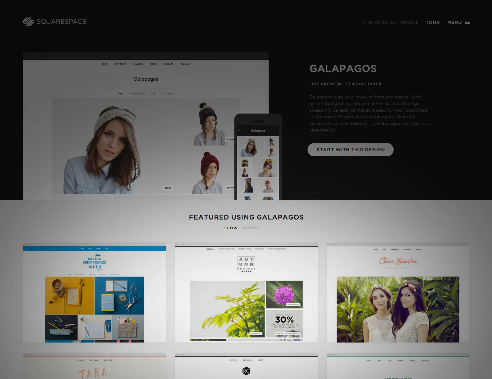
Our swansonslookbook.com - featured on Squarespace - custom coded to re-imagine a storefront template into a responsive fashion inspired "Lookbook". Content developed over 3 weeks, site developed in less than two days.
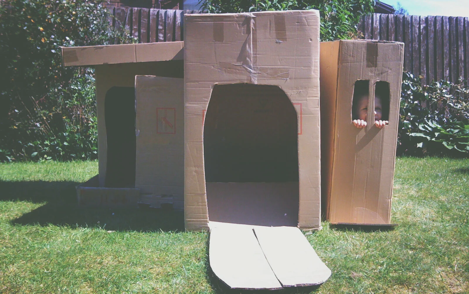
So there's my take. It's how you look at it. I don't see a bunch of templates, especially given the dev sandbox they offer, but a rather valuable tool to use when you need to stack your line somewhere else. Maybe it's a pop-up event, or an extended paid media run, or an extra video to cut. Either way, it's proved valuable in retaining our clients' trust. And that's what matters in this business right? As creators, we shouldn't ever lament being handed a box, but re-imagine what that box can do.
Need to see how a big brand leveraged it?
photo credit : Mike Carter


