Four Reasons Your Office Should Love the New Twitter Redesign
With a new social media redesign comes a flurry of social media posts complaining of the change. This happened most recently on Tuesday when Twitter announced a profile redesign. Twitter received lots of negative feedback for their changes but I’m here to give you reasons why you should rejoice!

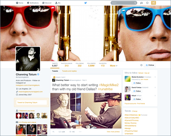
1. The design team will owe you coffee Did you notice that with the new header photo your Twitter background disappeared? Yes, that background you sat with the design team for hours determining the correct spacing to display messaging on the left-hand side. No more hours wasted on your custom background that no one saw on mobile. Congrats, your design team will celebrate when you send them the new Twitter header photo dimensions. Profile photo = 400x400 px // Header = 1500x500 px by the way!
2. It hasn't rolled out on mobile… yet Large header photo, pinned tweets and best tweets are the trifecta that make up Twitter’s new profile redesign. Does your team know what you’ll pin first? How do you utilize the extra header space? Don’t panic, you have time to figure it out. With no news from Twitter yet on when these features will roll out on mobile, you have time to adjust and test these new features.
3. Takes away hours of scrolling When you go on Twitter where do you spend 90% of your time? Chances are you're in the Twitter feed or curated lists. When you click on specific account, what information are you looking for? With Twitter’s new features, pinned and best tweets are created to provide you everything you'll need to know. No more scrolling through days of tweets, asking yourself 'what does their audience engage with?' Now you'll know before moving into business with them.
4. It serves as inspiration If you roll your eyes over a change in social media, you're in the wrong business. The number of times that social media platforms have modified or redesigned is endless. Don’t be frustrated but instead, send Twitter a thank you. This is the wake up call you needed to adjust your social media strategy. As community managers, strategists, content developers and analysts we should always be evaluating and taking notes to ensure we’re taking advantage of all opportunities on social media. Let Twitter’s redesign serve as inspiration for you to adjust your plan and get out of your regular, 5-tweets-a-day rut!
